Chart Controls
Every chart in Snapshot Decoder has a toolbar across the top and a small
Y-axis ruler panel on the left edge. Together they give you full control
over navigation, measurement, export, and axis scaling.
The toolbar runs across the top of every chart (and pop-out chart window).

From left to right the buttons and controls are:
| Button | Name | Description |
|---|
| Home |
Home |
Resets the chart to the original view after you have panned or zoomed.
Returns both axes to their full auto-scaled range. |
| ← |
Back |
Steps back through the view history (previous zoom or pan positions). |
| → |
Forward |
Steps forward through the view history after using Back. |
| Cross arrows |
Pan |
Click and drag the chart to pan in any direction.
Right-click and drag to zoom along a single axis.
This is a toggle – click again to deactivate. |
| Magnifying glass |
Zoom |
Click and drag a rectangle on the chart to zoom into that region.
Right-click and drag to zoom out.
This is a toggle – click again to deactivate. |
| Floppy disk |
Save as PDF |
Exports the current chart to a PDF file. The PDF includes chain-of-custody
metadata (file name, date/time, engine hours) and a Snapshot Decoder
version watermark. |
| Coordinates display |
Shows the current cursor position as (x, y) values.
When two axes are active it shows both the left and right Y values,
e.g. (00:41, 2.02) | (00:41, 292.). |
| Cart icon |
Add to Chart Cart |
Adds a snapshot of the current chart to the Chart Cart
dock panel. The cart collects charts for batch export to a multi-page PDF. |
| Value popup icon |
Value Display |
Toggle button. When active (highlighted blue), hovering over a data line
shows a tooltip with the exact PID value at that point. Uses
mplcursors for interactive data annotation. |
| Time icon |
Time Slider / Cursor |
Toggle button. When active, a vertical time cursor and a slider bar appear
below the chart. Drag the slider or the cursor line to scrub through time.
The exact time position is shown on the X-axis. |
| Stacked charts icon |
Separate Charts |
Toggle button (line charts only). When active, each selected PID is drawn on
its own stacked subplot with an independent, auto-scaled Y-axis instead of being
overlaid on the shared left/right axis chart. All subplots share the same X-axis,
so time alignment across PIDs is preserved. |
| Brain icon |
Quick IQ |
Opens the Quick IQ panel, which provides context-aware analysis
tips for the currently displayed chart. |
Axis Range Controls (inline)
Immediately after the chart buttons, the toolbar includes inline
Left Axis and Right Axis range controls:
| Control | Description |
|---|
| Auto checkbox |
When checked, the axis automatically scales to fit the data.
Uncheck it to type custom Min and Max values. |
| Min / Max fields |
Enter numeric values to lock the axis range. Changes are applied live
as soon as you press Tab or Enter.
Leave both axes on Auto to let the chart scale itself. |
Tip: When comparing the same PID across multiple snapshots, set identical
Min/Max ranges on both charts so the visual scale matches exactly.
Pop-out Button
At the far right of the toolbar is the Pop-out button (expand-in-new-window icon).
It opens the current chart in a separate resizable window with its own full toolbar,
rulers, and time slider. This is useful for side-by-side comparison or for maximizing
chart area on a second monitor. The pop-out button is not shown when the chart is
already in a pop-out window.
Y-Axis Rulers
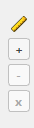
A small control strip sits on the left edge of the chart area, beside the Y-axis.
It lets you add horizontal reference lines (rulers) to the chart for quick
visual comparison against specific values.
From top to bottom the controls are:
| Button | Name | Description |
|---|
| Ruler icon |
Ruler indicator |
Visual indicator showing these controls are for Y-axis rulers. |
| + |
Add Ruler |
Adds a horizontal ruler line at the midpoint of the current left Y-axis range.
You can add multiple rulers. |
| − |
Remove Ruler |
Removes the currently selected ruler. If no ruler is selected, removes
the last one that was added. |
| x |
Clear All Rulers |
Removes all ruler lines from the chart at once. |
Interacting with Rulers
- Drag to reposition – Click on any ruler line and drag it up or down
to set it to an exact Y value. The value label updates in real time as you drag.
- Select a ruler – Click near a ruler to select it (highlighted).
The − button will then remove that specific ruler.
- Value labels – Each ruler displays its current Y value on the
left side of the chart so you can read exact reference points.
Use case: Add a ruler at a known specification limit (for example, a minimum
rail pressure threshold) to instantly see where the data crosses that boundary.
Typical Workflow
- Select PIDs – Check PIDs on the left or right axis from the Snapshot Data panel.
- Zoom in – Use the Zoom tool to focus on the area of interest.
- Enable Value Display – Toggle the value popup to read exact data points.
- Add rulers – Place horizontal rulers at specification limits.
- Adjust axis ranges – Uncheck Auto and enter Min/Max for precise scaling.
- Export – Save as PDF or add to the Chart Cart for batch export.
Quick Tip: You can quickly reset your chart by clicking the
Clear Chart button on the Snapshot Data panel, which removes all PIDs
from both axes and returns everything to its default state.